Graphics
Introduction
This section shows how to make R graphics from rpy2, using some of the different graphics systems available to R users.
The purpose of this section is to get users going, and be able to figure out by reading the R documentation how to perform the same plot in rpy2.
Graphical devices
With R, all graphics are plotted into a so-called graphical device. Graphical devices can be interactive, like for example X11, or non-interactive, like png or pdf. Non-interactive devices appear to be files. It is possible to create custom graphical devices from Python/rpy2, but this an advanced topic (see Custom graphical devices).
By default an interactive R session will open an interactive device when needing one. If a non-interactive graphical device is needed, one will have to specify it.
Note
Do not forget to close a non-interactive device when done. This can be required to flush pending data from the buffer.
The module grdevices aims at representing the R package
grDevices*. Example with the R functions png and dev.off:
from rpy2.robjects.packages import importr
grdevices = importr('grDevices')

grdevices.png(file="path/to/file.png", width=512, height=512)
# plotting code here
grdevices.dev_off()
The package contains an Environment grdevices_env that
can be used to access an object known to belong to that R packages, e.g.:
>>> palette = grdevices.palette()
>>> print(palette)
[1] "black"   "red"     "green3"  "blue"    "cyan"    "magenta" "yellow"
[8] "gray"
Getting ready
To run examples in this section we first import
rpy2.robjects and define few helper
functions.
import rpy2.robjects as robjects
from rpy2.robjects import Formula, Environment
from rpy2.robjects.vectors import IntVector, FloatVector
from rpy2.robjects.lib import grid
from rpy2.robjects.packages import importr, data
from rpy2.rinterface_lib.embedded import RRuntimeError
import warnings

# The R 'print' function
rprint = robjects.globalenv.find("print")
stats = importr('stats')
grdevices = importr('grDevices')
base = importr('base')
datasets = importr('datasets')
Package lattice
Introduction
Importing the package lattice is done the same as it is done for other R packages.
lattice = importr('lattice')
Scatter plot
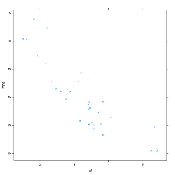
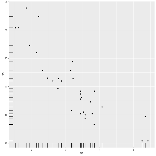
We use the dataset mtcars, and will use the lattice function xyplot to make scatter plots.
xyplot = lattice.xyplot
Lattice is working with formulae (see Formulae), therefore we build one and store values in its environment. Making a plot is then a matter of calling the function xyplot with the formula as as an argument.
datasets = importr('datasets')
mtcars = data(datasets).fetch('mtcars')['mtcars']
formula = Formula('mpg ~ wt')
formula.getenvironment()['mpg'] = mtcars.rx2('mpg')
formula.getenvironment()['wt'] = mtcars.rx2('wt')

p = lattice.xyplot(formula)
rprint(p)
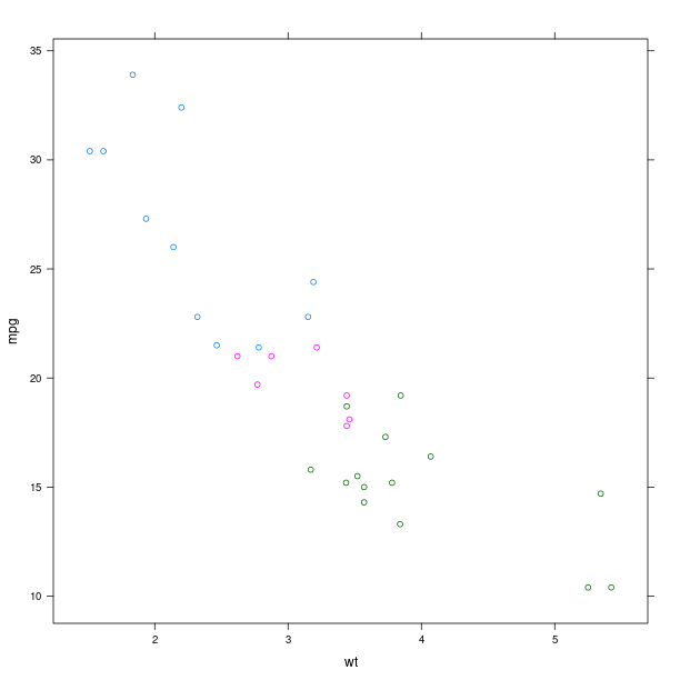
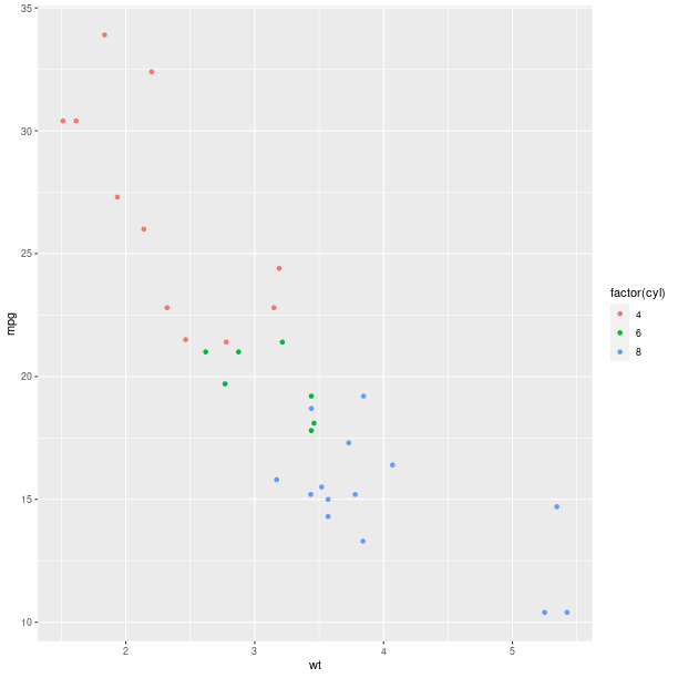
The display of group information can be done simply by using the named parameter groups. This will indicate the different groups by color-coding.
p = lattice.xyplot(formula, groups = mtcars.rx2('cyl'))
rprint(p)
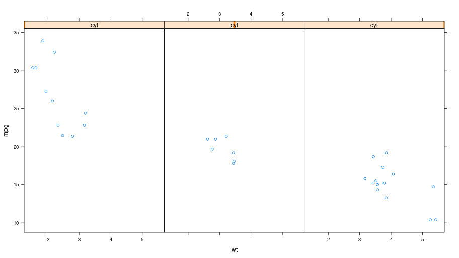
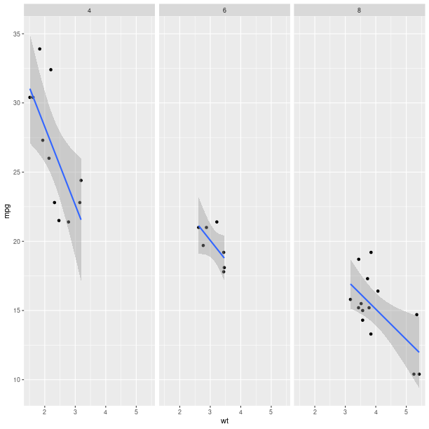
An alternative to color-coding is to have points is different panels. In lattice, this done by specifying it in the formula.
formula = Formula('mpg ~ wt | cyl')
formula.getenvironment()['mpg'] = mtcars.rx2('mpg')
formula.getenvironment()['wt'] = mtcars.rx2('wt')
formula.getenvironment()['cyl'] = mtcars.rx2('cyl')

p = lattice.xyplot(formula, layout = IntVector((3, 1)))
rprint(p)
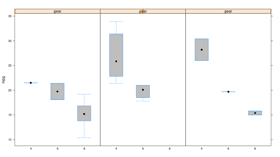
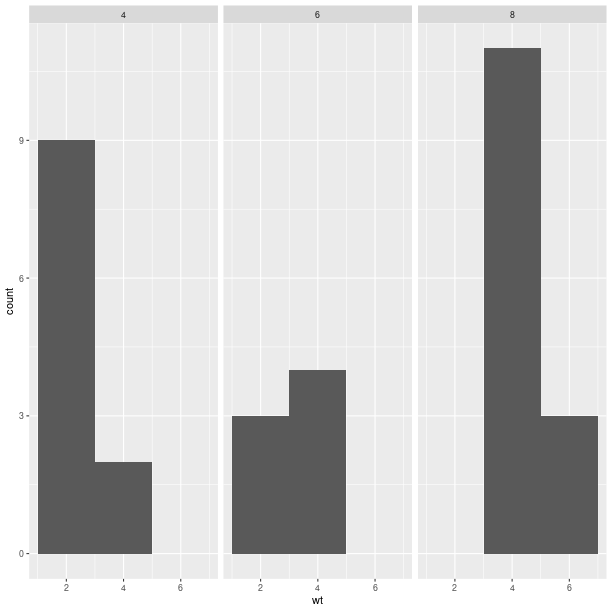
Box plot
p = lattice.bwplot(Formula('mpg ~ factor(cyl) | gear'),
                   data = mtcars, fill = 'grey')
rprint(p, nrow=1)
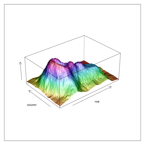
Other plots
The R package lattice contains a number of other plots, which unfortunately cannot all be detailled here.
tmpenv = data(datasets).fetch("volcano")
volcano = tmpenv["volcano"]

p = lattice.wireframe(volcano, shade = True,
                      zlab = "",
                      aspect = FloatVector((61.0/87, 0.4)),
                      light_source = IntVector((10,0,10)))
rprint(p)
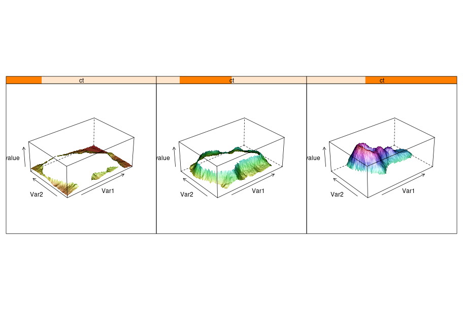
Splitting the information into different panels can also be specified in the formula. Here we show an artifial example where the split is made according to the values plotted on the Z axis.
reshape2 = importr('reshape2')
dataf = reshape2.melt(volcano)
dataf = dataf.cbind(ct = lattice.equal_count(dataf.rx2("value"), number=3, overlap=1/4))
p = lattice.wireframe(Formula('value ~ Var1 * Var2 | ct'),
                      data = dataf, shade = True,
                      aspect = FloatVector((61.0/87, 0.4)),
                      light_source = IntVector((10,0,10)))
rprint(p, nrow = 1)
Package ggplot2
Introduction
The R package ggplot2 implements the Grammar of Graphics. While more documentation on the package and its usage with R can be found on the ggplot2 website, this section will introduce the basic concepts required to build plots. Obviously, the R package ggplot2 is expected to be installed in the R used from rpy2.
The package is using the grid lower-level plotting infrastructure, that can be accessed
through the module rpy2.robjects.lib.grid. Whenever separate plots on the same device,
or arbitrary graphical elements overlaid, or significant plot customization, or editing,
are needed some knowledge of grid will be required.
Here again, having data in a DataFrame is expected
(see DataFrame for more information on such objects).
import math, datetime
import rpy2.robjects.lib.ggplot2 as ggplot2
import rpy2.robjects as ro
from rpy2.robjects.packages import importr
base = importr('base')

mtcars = data(datasets).fetch('mtcars')['mtcars']
rnorm = stats.rnorm
dataf_rnorm = robjects.DataFrame({'value': rnorm(300, mean=0) + rnorm(100, mean=3),
                                  'other_value': rnorm(300, mean=0) + rnorm(100, mean=3),
                                  'mean': IntVector([0, ]*300 + [3, ] * 100)})
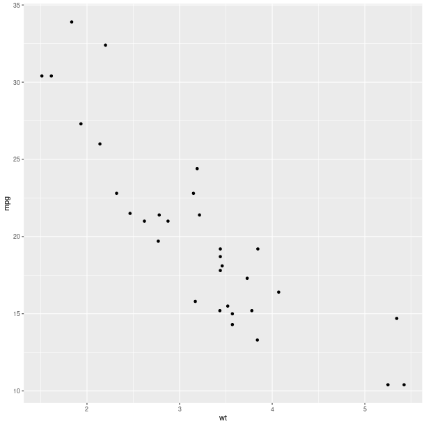
Plot
gp = ggplot2.ggplot(mtcars)

pp = (gp +
      ggplot2.aes_string(x='wt', y='mpg') +
      ggplot2.geom_point())

pp.plot()
Aesthethics mapping
An important concept for the grammar of graphics is the mapping of variables, or columns in a data frame, to graphical representations.
Like it was shown for lattice, a third variable can be represented
on the same plot using color encoding, and this is now done by
specifying that as a mapping (the parameter col when calling
the constructor for the AesString).
gp = ggplot2.ggplot(mtcars)

pp = (gp +
      ggplot2.aes_string(x='wt', y='mpg', col='factor(cyl)') +
      ggplot2.geom_point())

pp.plot()
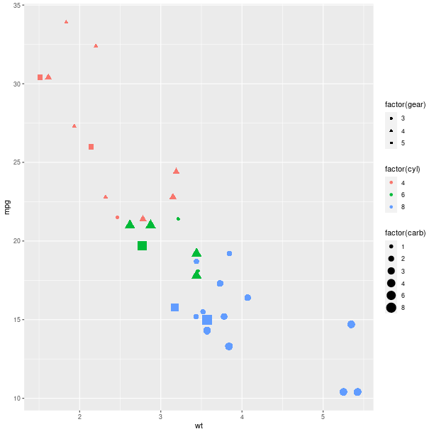
The size of the graphical symbols plotted (here circular dots) can also be mapped to a variable:
pp = (gp +
      ggplot2.aes_string(x='wt', y='mpg', size='factor(carb)',
                         col='factor(cyl)', shape='factor(gear)') +
      ggplot2.geom_point())

pp.plot()
Geometry
The geometry is how the data are represented. So far we used a scatter plot of points, but there are other ways to represent our data.
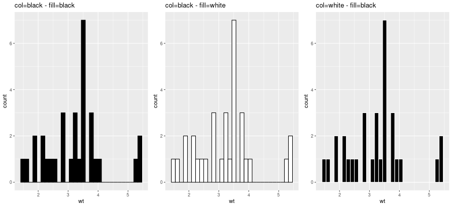
Looking at the distribution of univariate data can be achieved with an histogram:
gp = ggplot2.ggplot(mtcars)

pp = (gp +
      ggplot2.aes_string(x='wt') +
      ggplot2.geom_histogram(bins = 30))

#pp.plot()
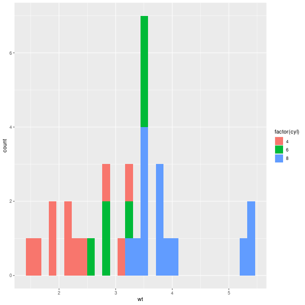
gp = ggplot2.ggplot(mtcars)

pp = (gp +
      ggplot2.aes_string(x='wt', fill='factor(cyl)') +
      ggplot2.geom_histogram(bins=30))

pp.plot()
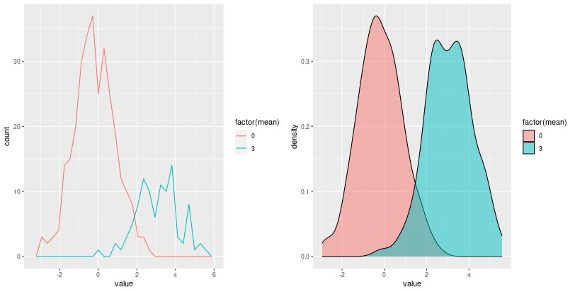
Barplot-based representations of several densities on the same
figure can often be lacking clarity and line-based representation,
either geom_freqpoly() (representation of the frequency as broken
lines) or geom_density() (plot a density estimate),
can be in better.
pp = (gp +
      ggplot2.aes_string(x='value', fill='factor(mean)') +
      ggplot2.geom_density(alpha = 0.5))
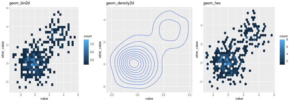
Whenever a large number of points are present, it can become interesting to represent the density of “dots” on the scatterplot.
With 2D bins:
gp = ggplot2.ggplot(dataf_rnorm)

pp = (gp +
      ggplot2.aes_string(x='value', y='other_value') +
      ggplot2.geom_bin2d() +
      ggplot2.ggtitle('geom_bin2d'))
pp.plot(vp = vp)
With a kernel density estimate:
gp = ggplot2.ggplot(dataf_rnorm)

pp = (gp +
      ggplot2.aes_string(x='value', y='other_value') +
      ggplot2.geom_density2d() +
      ggplot2.ggtitle('geom_density2d'))
pp.plot(vp = vp)
With hexagonal bins:
gp = ggplot2.ggplot(dataf_rnorm)

pp = (gp +
      ggplot2.aes_string(x='value', y='other_value') +
      ggplot2.geom_hex() +
      ggplot2.ggtitle('geom_hex'))
pp.plot(vp = vp)
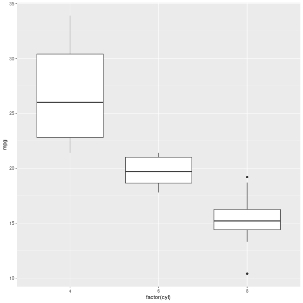
Box plot:
gp = ggplot2.ggplot(mtcars)

pp = (gp +
      ggplot2.aes_string(x='factor(cyl)', y='mpg') +
      ggplot2.geom_boxplot())

pp.plot()
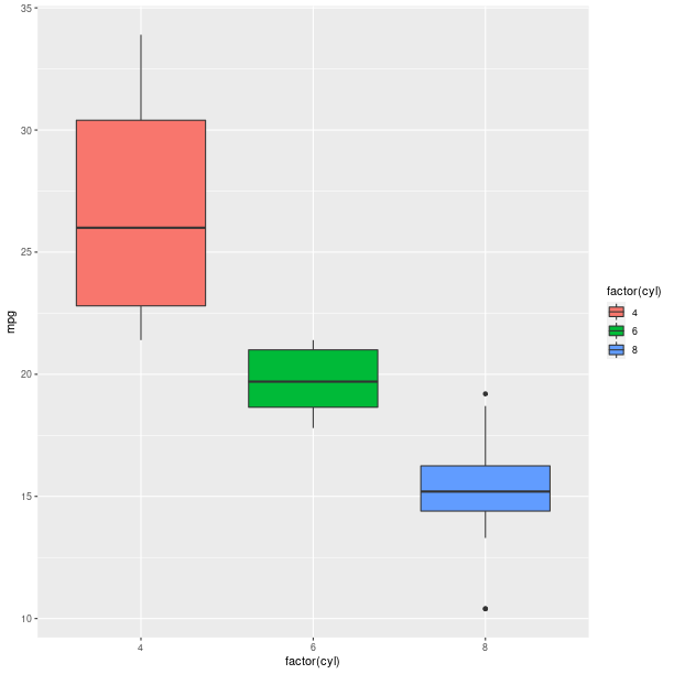
Boxplots can be used to represent a summary of the data with an emphasis on location and spread.
gp = ggplot2.ggplot(mtcars)

pp = (gp +
      ggplot2.aes_string(x='factor(cyl)', y='mpg', fill='factor(cyl)') +
      ggplot2.geom_boxplot())

pp.plot()
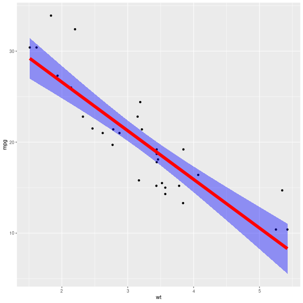
Models fitted to the data are also easy to add to a plot:
pp = (gp +
      ggplot2.aes_string(x='wt', y='mpg') +
      ggplot2.geom_point() +
      ggplot2.stat_smooth(method = 'lm'))
pp.plot()
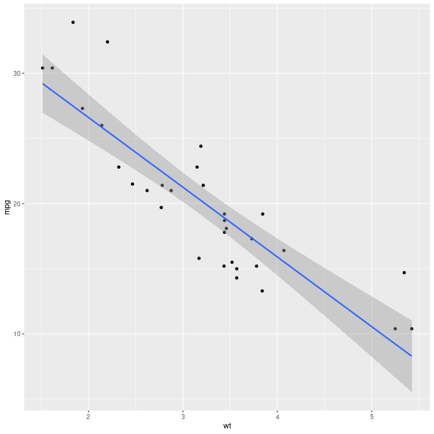
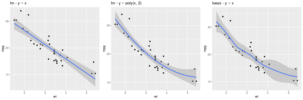
The method can be one of {glm, gam, loess, rlm}, and formula can be specified to declared the fitting (see example below).
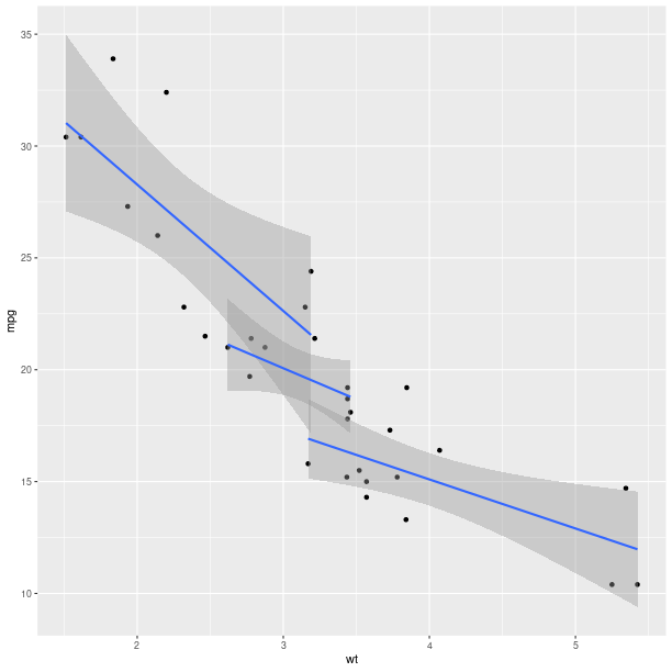
The constructor for GeomSmooth also accepts a parameter
groupr that indicates if the fit should be done according to groups.
pp = (gp +
      ggplot2.aes_string(x='wt', y='mpg') +
      ggplot2.geom_point() +
      ggplot2.geom_smooth(ggplot2.aes_string(group = 'cyl'),
                          method = 'lm'))
pp.plot()
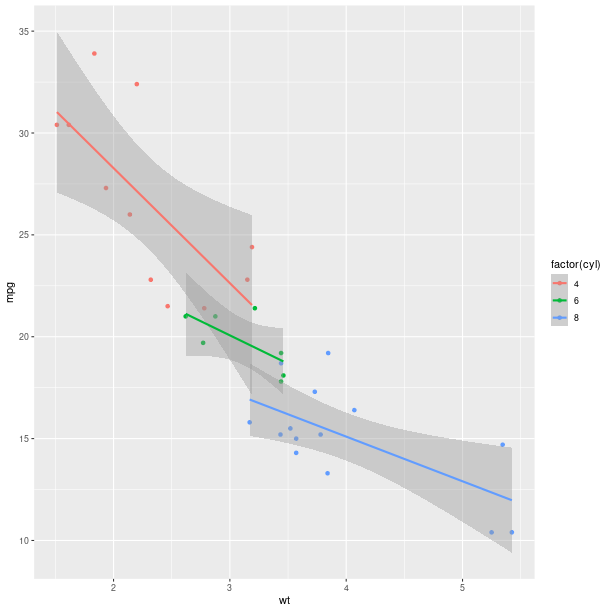
Encoding the information in the column cyl is again
only a matter of specifying it in the AesString mapping.
pp = (ggplot2.ggplot(mtcars) +
      ggplot2.aes_string(x='wt', y='mpg', col='factor(cyl)') +
      ggplot2.geom_point() +
      ggplot2.geom_smooth(ggplot2.aes_string(group = 'cyl'),
                          method = 'lm'))
pp.plot()
As can already be observed in the examples with GeomSmooth,
several geometry objects can be added on the top of each other
in order to create the final plot. For example, a marginal rug
can be added to the axis of a regular scatterplot:
gp = ggplot2.ggplot(mtcars)

pp = (gp +
      ggplot2.aes_string(x='wt', y='mpg') +
      ggplot2.geom_point() +
      ggplot2.geom_rug())

pp.plot()
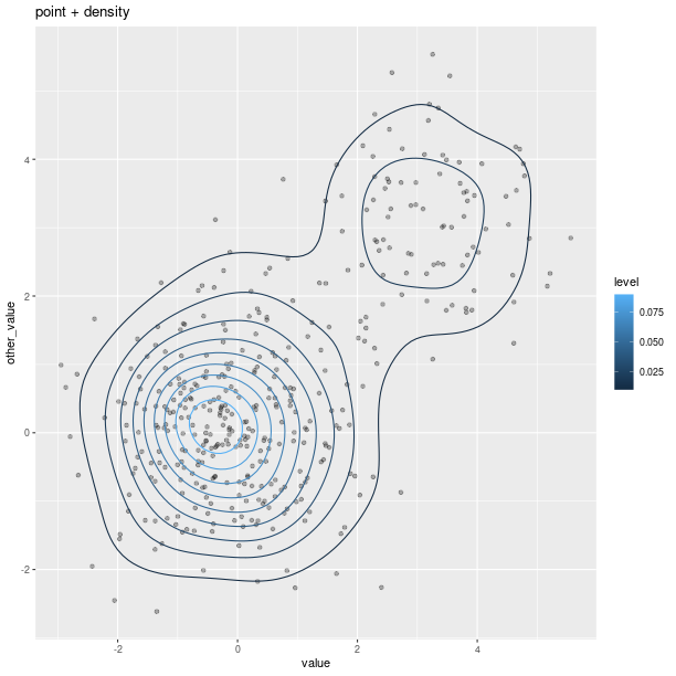
gp = ggplot2.ggplot(dataf_rnorm)

pp = (gp +
      ggplot2.aes_string(x='value', y='other_value') +
      ggplot2.geom_point(alpha = 0.3) +
      ggplot2.geom_density2d(ggplot2.aes_string(col = '..level..')) +
      ggplot2.ggtitle('point + density'))
pp.plot()
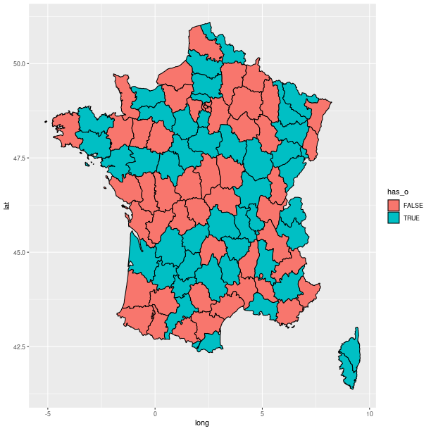
Polygons can be used for maps, as shown in the relatively artificial example below:
map = importr('maps')
fr = ggplot2.map_data('france')

# add a column indicating which region names have an "o".
fr = fr.cbind(has_o = base.grepl('o', fr.rx2("region"),
                                 ignore_case = True))
p = (ggplot2.ggplot(fr) +
     ggplot2.geom_polygon(
        ggplot2.aes_string(x = 'long', y = 'lat',
                           group = 'group', fill = 'has_o'),
        col="black"))
p.plot()
Axes
Axes can be transformed and configured in various ways.
A common transformation is the log-transform of the coordinates.
from rpy2.robjects.lib import grid
grid.newpage()
grid.viewport(layout=grid.layout(2, 3)).push()

ggplot2_rpack = importr('ggplot2')
diamonds = ggplot2_rpack.__rdata__.fetch('diamonds')['diamonds']
gp = ggplot2.ggplot(diamonds)

for col_i, trans in enumerate(("identity", "log2", "sqrt")):
   # fetch viewport at position col_i+1 on the first row
   vp = grid.viewport(**{'layout.pos.col':col_i+1, 'layout.pos.row': 1})
   pp = (gp +
         ggplot2.aes_string(x='carat', y='price') +
         ggplot2.geom_point(alpha=0.1, size=1) +
         ggplot2.coord_trans(x=trans, y=trans) +
         ggplot2.ggtitle("%s on axis" % trans))
   # plot into the viewport
   pp.plot(vp = vp)

   # fetch viewport at position col_i+1 on the second row
   vp = grid.viewport(**{'layout.pos.col':col_i+1, 'layout.pos.row': 2})
   pp = (gp +
         ggplot2.aes_string(x='%s(carat)' % trans, y='%s(price)' % trans) +
         ggplot2.geom_point(alpha=0.1, size=1) +
         ggplot2.ggtitle("%s(<variable>)" % trans))
   pp.plot(vp = vp)
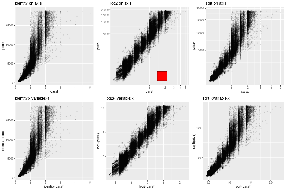
Note
The red square is an example of adding graphical elements to a ggplot2 figure.
vp = grid.viewport(**{'layout.pos.col':2, 'layout.pos.row': 1})
g = grid.rect(x=grid.unit(0.7, "npc"),
              y=grid.unit(0.2, "npc"),
              width=grid.unit(0.1, "npc"),
              height=grid.unit(0.1, "npc"),
              gp=grid.gpar(fill = "red"),
              vp=vp)
g.draw()
Facets
Splitting the data into panels, in a similar fashion to what we did with lattice, is now a matter of adding facets. A central concept to ggplot2 is that plot are made of added graphical elements, and adding specifications such as “I want my data to be split in panel” is then a matter of adding that information to an existing plot.
For example, splitting the plots on the data in column cyl
is still simply done by adding a FacetGrid.
pp = (gp +
      ggplot2.aes_string(x='wt', y='mpg') +
      ggplot2.geom_point() +
      ggplot2.facet_grid(ro.Formula('. ~ cyl')) +
      ggplot2.geom_smooth(ggplot2.aes_string(group="cyl"),
                          method = "lm",
                          data = mtcars))

pp.plot()
The way data are represented (the geometry in the terminology used the grammar of graphics) are still specified the usual way.
pp = (gp +
      ggplot2.aes_string(x='wt') +
      ggplot2.geom_histogram(binwidth=2) +
      ggplot2.facet_grid(ro.Formula('. ~ cyl')))

pp.plot()
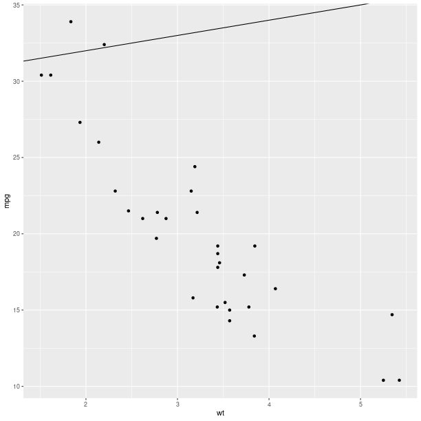
pp = (gp +
      ggplot2.aes_string(x='wt', y='mpg') +
      ggplot2.geom_point() +
      ggplot2.geom_abline(intercept = 30))
pp.plot()
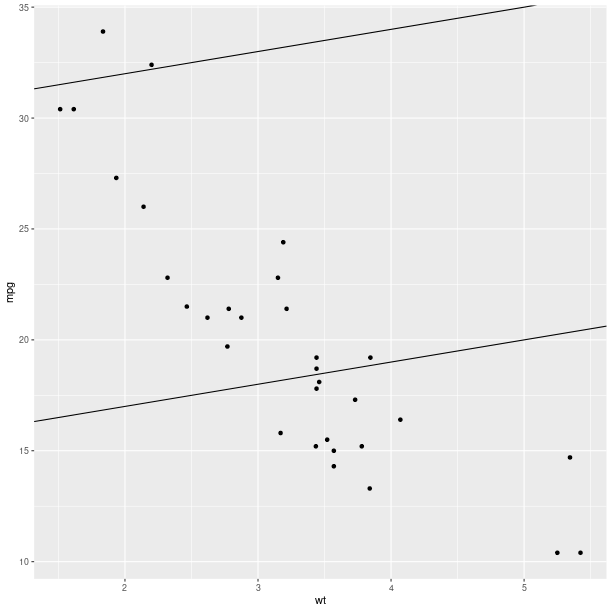
pp = (gp +
      ggplot2.aes_string(x='wt', y='mpg') +
      ggplot2.geom_point() +
      ggplot2.geom_abline(intercept = 30) +
      ggplot2.geom_abline(intercept = 15))
pp.plot()
pp = (gp +
      ggplot2.aes_string(x='wt', y='mpg') +
      ggplot2.geom_point() +
      ggplot2.stat_smooth(method = 'lm', fill = 'blue',
                          color = 'red', size = 3))
pp.plot()
pp = (gp +
      ggplot2.aes_string(x='wt', y='mpg') +
      ggplot2.geom_point() +
      ggplot2.stat_smooth(method = 'lm', fill = 'blue',
                          color = 'red', size = 3))
pp.plot()
Extensions and new features
The R package ggplot2 is under active development, and new methods (geometry, summary statistics, theme customizations) are added regularly. In addition to this there exists a dynamic ecosystem of R packages proposing extensions, and a user may need R code for ggplot2 not included in our module. The following steps should make writing the Python wrapper code a very minimal effort in many cases:
Identify the matching type of extension in our class diagram for
rpy2.robjects.lib.ggplot2(for example, is this an new “geometry”, statistics, coordinates, theme ?). For example the ggplot2 function stat_quantile is a statistics and the best matching class isrpy2.robjects.lib.ggplot2.Stat. The more general ancestor classrpy2.robjects.lib.ggplot2.GBaseObjectcould also be used.Implement a child class that assign to the class attribute
_constructorthe R constructor function. For example stat_quantile. The Python callable mapping the R constructor is then the class methodnew(). The complete implementation for stat_quantile is then:from rpy2.robjects.packages import importr ggplot2_rpack = importr('ggplot2') class StatQuantile(Stat): """ Continuous quantiles """ _constructor = ggplot2_rpack.stat_quantile stat_quantile = StatQuantile.new
The callable
stat_quantile()can now be used like any other ggplot2 statistics inrpy2.robjects.lib.ggplot2(and the object it returns can be added to compose a final ggplot figure).
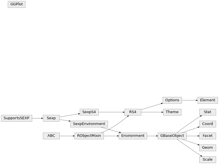
Class diagram
Package grid
The grid package is the underlying plotting environment for lattice and ggplot2 figures. In few words, it consists in pushing and poping systems of coordinates (viewports) into a stack, and plotting graphical elements into them. The system can be thought of as a scene graph, with each viewport a node in the graph.
>>> from rpy2.robjects.lib import grid
Getting a new page is achieved by calling the function grid.newpage().
Calling layout() will create a layout, e.g. create a layout with one row
and 3 columns:
>>> lt = grid.layout(1, 3)
That layout can be used to construct a viewport:
>>> vp = grid.viewport(layout = lt)
The created viewport corresponds to a graphical entity.
Pushing into the current viewport, can be done by using the class method
grid.Viewport.push():
>>> vp.push()
Example:
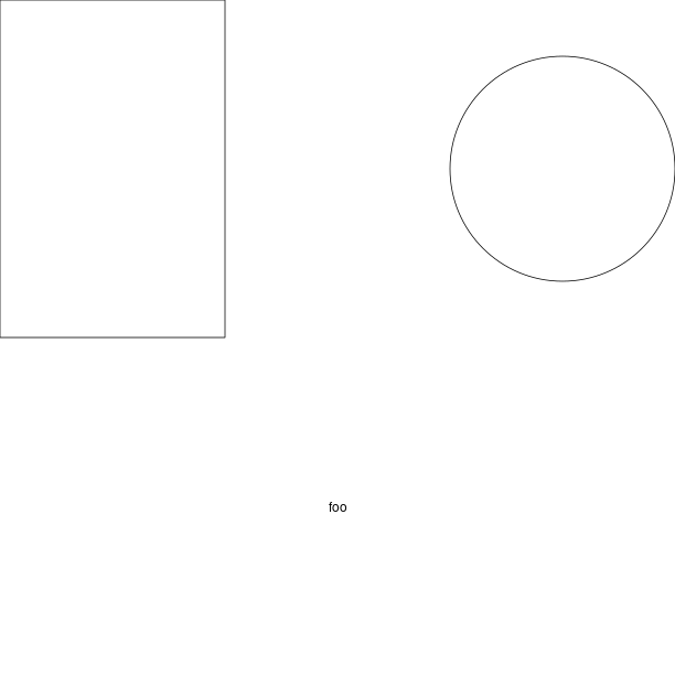
grid.newpage()
# create a rows/columns layout
lt = grid.layout(2, 3)
vp = grid.viewport(layout = lt)
# push it the plotting stack
vp.push()

# create a viewport located at (1,1) in the layout
vp = grid.viewport(**{'layout.pos.col':1, 'layout.pos.row': 1})
# create a (unit) rectangle in that viewport
grid.rect(vp = vp).draw()

vp = grid.viewport(**{'layout.pos.col':2, 'layout.pos.row': 2})
# create text in the viewport at (1,2)
grid.text("foo", vp = vp).draw()

vp = grid.viewport(**{'layout.pos.col':3, 'layout.pos.row': 1})
# create a (unit) circle in the viewport (1,3)
grid.circle(vp = vp).draw()
Custom ggplot2 layout with grid
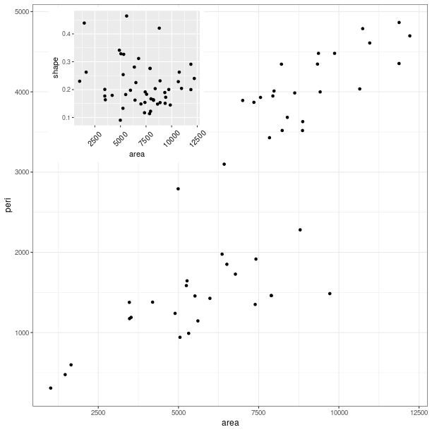
grid.newpage()

# create a viewport as the main plot
vp = grid.viewport(width = 1, height = 1)
vp.push()

tmpenv = data(datasets).fetch("rock")
rock = tmpenv["rock"]

p = (ggplot2.ggplot(rock) +
     ggplot2.geom_point(ggplot2.aes_string(x = 'area', y = 'peri')))
p += ggplot2.theme_bw()
p.plot(vp = vp)

vp = grid.viewport(width = 0.6, height = 0.6, x = 0.37, y=0.69)
vp.push()
p = (ggplot2.ggplot(rock) +
     ggplot2.geom_point(ggplot2.aes_string(x = 'area', y = 'shape')) +
     ggplot2.theme(**{'axis.text.x': ggplot2.element_text(angle = 45)}))

p.plot(vp = vp)
Classes
- class rpy2.robjects.lib.grid.Viewport(o)[source]
Bases:
RObjectDrawing context. Viewports can be thought of as nodes in a scene graph.
Class diagram